46

When I am preparing slides for a course (as I have been today, weekend be damned), aside from questions of pacing and exposition, I often find myself asking various questions about the layout of slides such as:

  • Should bullets generally be introduced one-by-one using animations or should the entire slide be displayed immediately?
  • Is animation generally good or bad for lecture slides?
  • What is a good approach to take for titling slides?
  • Should I include "separation slides" to chunk content?
  • What is the optimal amount of information per slide?
  • Slides should be numbered, but is it better to give the total number of slides on each (e.g., 4/20) or just the current slide (e.g., 4)?

These are all small questions but I think they add up to something non-trivial in the overall didactic potential of the slides.

I have my own opinions on these questions and I feel that I have a good intuitive sense of how to structure slides, but my hunches are just hunches.

Hence this question is looking for either:

  1. Pointers to scientific studies or other well-argued material on good slide design for teaching
  2. First-hand answers to the above questions (and related ones) accompanied by solid argumentation/anecdotal experience (rather than just subjective preferences)

I'm looking for answers that specifically target teaching rather than research presentations. (For me, there is a significant difference.) I'm also looking for answers that target slide layout and design rather than talk structure.

And though I appreciate that the notion of good slide design varies between different subjects, I still think that there is a meaty intersection of good practices that one could follow across all disciplines. It is precisely this intersection that the question targets.

My students thank you in advance!


On a side note, here's a nice slightly-related question on what to do with the last slide.

2

16 Answers 16

33

This morning I watched a video about how powerpoint is killing our ability to teach properly. It can be seen as a lesson in bad slide design. One key message is if you are reading your slides to the students, you are not teaching. Ultimately, slides should just contain key information, and you should tell the rest of the story.

Regarding some of the other points: animation of text should be left to Walt Disney; there should be one idea per slide (slides are free!); separation slides are a good idea to let the listener know when topics have finished, which is especially helpful if the separation slides are blank (or even black!).

Less is more. If you want to give the students more, prepare a handout.

14
  • 34
    Powerpoint doesn't kill people. Bullets kill people.
    – JeffE
    Commented Mar 8, 2014 at 22:28
  • 11
    @JeffE I once met a well know faculty member at a conference who had an interesting presentation about "power corrupts, powerpoint corrupts pointlessly". He belonged to the LaTeX camp (as do I) but I digress!
    – dearN
    Commented Mar 8, 2014 at 22:39
  • 21
    @drN I've sat through enough LaTeX/Beamer based presentations to disbelieve that the solution is to switch to it. Or Keynote. Or anything else. It's not the software that's the problem.
    – Fomite
    Commented Mar 10, 2014 at 21:57
  • 4
    @drN: LaTeX slides look terrible. Or at least, default Beamer slides look incredibly outdated. Commented Mar 13, 2014 at 13:44
  • 3
    @drN LaTeX can look good. I personally, paste latex formulas into Keynote (which is not without problems). I wouldn't touch Powerpoint with an electric cable. Commented Mar 13, 2014 at 15:03
19

As a graduate student, I want to share my experience from students' point of view. I am assuming that you somehow make your slides available for students as study material. So if that is the case, the amount of information you put on the slides becomes a crucial trade-off. And we have to accept that some students who are not paying much attention during the lecture use those slides to learn the subject. Given that, I like the slides that somehow gives me a good idea about the topic, independent from the lecture.

I know that you should keep the amount of text on the slides at a minimum level, but to increase the teaching strength of your slides, you can put as many references to other course material or online sources. So that your slides are actually helpful outside of your lecture, too.

As for the layout (again from a students' perspective);

  • Bullets should be OK to support the flow of ideas, but definitely no animations for bullets.
  • In general, I am not against animations but they should be subtle and not for text. Maybe you need to explain something on a figure, and a gentle animation helps students to better see what is actually changing from the previous figure.
  • I would support titling the slides, as it helps students to understand what you are talking about at that moment, in the highly unlikely event of distraction :)
  • Separation slides are also helpful for students to see what the main topics in the lecture are and how they are separated.
  • Slide numbers, well I do not think it matters much, but it doesn't hurt to put a page number like "4/20"

These are what I think about ideal lecture slides. And for the third time this is a perspective from a student, and somewhat my personal preference, but I used to discuss these with my peers a lot.

5
  • 9
    I do not agree. If there is too much material for a good presentation, but still want it to be available for students, just put them in comments, or make a separated full-fledged article with all the content first and then reduce this content into a presentation. Slides aren't standalone articles, they are made to support your presentation only.
    – gaborous
    Commented Mar 9, 2014 at 22:47
  • 2
    @user1121352 I understand your point. And frankly, that's better than my suggestion. If the lecturer has well prepared classnotes or other study material that can provide enough for students to self study, slides can have to sole purpose of supporting the presentation. On the other hand, I still would not prefer my professors to hand me some slides as the only source, if they do not make any sense at all by themselves. Commented Mar 9, 2014 at 22:58
  • 3
    Doesn't the x/y page number make it a bit discouraging? Commented Jun 25, 2014 at 21:09
  • 2
    @SimonKuang: I am not sure what your photo is trying to convey, but I think I agree with it: It is very discouraging because you cannot see the end, you have no way to estimate how far along the tunnel you are, and thus orientation is completely missing. Hence, by all means, always do include the total number of slides along with the number of the current slide, to provide the audience with an important indicator of the progress of the explanation. (The total number may be replaced with something more structure-specific; e.g. I like seeing a schematic display of sections and subsections.) Commented Aug 21, 2014 at 9:19
  • 1
    This kind of trade-off is a bad idea, as you'll achieve neither aim: you'll have noisy slides, and students won't be able to learn from them. Make clean slides that support the presentation, and put extensive comments next to them in the online version. This isn't as much work as you'd think it is, and it has the added benefit of helping you to flesh out your story. Commented Oct 7, 2014 at 14:05
16

I teach mathematics, which is traditionally done using blackboards. I try to design my slides to recreate the best features of blackboards, as far as possible.

  • I use LaTeX with beamer rather than Powerpoint
  • I make the slides appear bit by bit, not even a full bullet point at a time. Each step in a calculation appears on its own, so I can talk about it before the next step appears.
  • I have occasional animated diagrams, in contexts where they actually add something to the explanation.
  • Conventional wisdom says that you should have a small amount of information per slide. I don't know if that is good advice for other subjects, but it is very bad for mathematics. Traditionally you can use several large blackboards and thus have definitions, diagrams and all stages of a long calculation or proof visible at the same time. It is much easier to get lost if you do not have all those things in front of you. I spend a lot of time tweaking my slides to get as close to that ideal as possible. Often I have to put a bar across the middle of the slide, with reminders from previous slides above, and new content below.

You can see examples from a number of different courses at

http://neil-strickland.staff.shef.ac.uk/courses/

5
  • +1, plus you can always write over the presentation with a pen to explain some equations more in-details.
    – gaborous
    Commented Mar 9, 2014 at 22:54
  • 2
    " I spend a lot of time tweaking my slides to get as close to this ideal as possible." Then I'm confused, why not use blackboard?
    – Ri49
    Commented Mar 10, 2014 at 1:45
  • @Ri49 I cannot speak for the answerer but in my case it forces me to be as concise as possible, and I often end up with more clear formulations than I first had done.
    – gaborous
    Commented Mar 10, 2014 at 5:05
  • 1
    @Ri49: Firstly, I often teach in rooms that don't have blackboards. The rooms in the maths building have them, but the biggest courses have to use rooms in other buildings. Secondly, I find it easier to keep everything well organised if I use slides. Commented Mar 10, 2014 at 7:03
  • 3
    I think the conventional wisdom is more about not overwhelming the audience with too much new information at once. When slides are revealed fully, that means you should have a small amount of information on each slide, but in your scheme where you reveal a slide piece by piece, it's those individual pieces that should be small, and you can still pack a lot of them on to one slide.
    – David Z
    Commented Mar 11, 2014 at 5:55
13

Why do you need to use slides? They change the classroom dynamic in a subtle but very important way, making the students look at the slides rather than at you. This is subjective, but none of my best professors used slides, except to show pictures. I strongly recommend using the board whenever possible.

11
  • 2
    +1 for this. The question really should be lest 'what is the best slide design' and more 'are slides really the best way to teach'?
    – DA.
    Commented Mar 9, 2014 at 7:17
  • 5
    A good comment, but not an answer to the question that was asked, therefore downvoting. (The OP shouldn't have to explain to our satisfaction his reasons for using slides to get an answer to his question about slide design)
    – ff524
    Commented Mar 9, 2014 at 21:25
  • 2
    @user1121352: I disagree with a part of your statement: If the students look at you, then that is because you badly designed the presentation. A lecture is not a tv talk show, it is not about the person talking, it is about the information they are presenting. In a well-designed presentation, the ears are with the presenter, the eyes with the slides, and the mind with the ideas that emerge from the combination of those two. Commented Aug 21, 2014 at 9:09
  • 2
    @O.R.Mapper: I don't know how you do your presentations, but in mine I am not just speaking, I also do point to important points, draw schemas on the blackboard and use gestures to illustrate my point. Of course a lecture is not about the person talking, but it's not about the slides either, it's about the knowledge you're trying to convey, so of course students should read the slides, but only sparsely. I disagree that the eyes should be with the slides: they should be on the presenter, and move on slides only when the presenter point to them.
    – gaborous
    Commented Aug 22, 2014 at 18:23
  • 2
    @O.R.Mapper: of course if you always handwrite the same visuals in every iteration of your lecture, this means that you've badly prepared. But I'm here talking about "tailored visuals", the kind of visuals that you draw on-the-fly because someone didn't quite understand your point, or maybe because the question slightly drifted to another close subject and you try to draw the similarities or dissimilarities. This kind of visuals can't be put in your slides because you can't know every question you may be asked, and anyway you can't put them all in slides.
    – gaborous
    Commented Aug 24, 2014 at 14:00
11

From my (student) perspective, there is no such thing as slides that are good both for lecture and self-study. Slides for lecture should contain as little information as possible (following general good presentation rules). This will never be enough material for somebody who did not attend the lecture to learn (if you intend to provide such material).

For example, I had a professor, who made very good presentations. There was the concept of business requirements included in them (just the notion, with no definition, which is good for presentation). I spent 10 minutes arguing with my colleagues who did not attend the lecture that it does not mean only how much money you have to spend for project, but also the whole environment the project will be held in. If they studied without me they would be mislead. I knew what it was supposed to mean because I noted it down on slides copy.

That's when we come taking notes. My favourite workflow for lectures was when I could print the notes before the lecture (from Internet) and then take notes on them. This made me concentrate on the lecture very well, because I had to find the things that require additional notes in what the lecturer was saying, but I didn't have to note everything (I would not have time for this).

Remember that using slides makes yourself faster: you don't have to type notions/names/equations on the blackboard, while your students still have to do this. You must take this into consideration if you want them to have correct notes (and then learn all the facts properly).

If you already have the slides that include definitions, longer texts, you can make them more lecture-friendly fast, by making most important words/terms/ideas bold.

6

I agree with @David Clarke and I think the thing that will be most beneficial, no matter how your slide show is arranged, is making your slides available ahead of time. There's 2 reasons I think this is helpful.

1) If I have the slides before class I have a more clear picture of where we are going than that one phrase about today in the syllabus does.

2) When I don't have to worry about trying to write or type every word on your slide it's easier for me to be able to listen to what you are actually saying and ask questions without being scared I'll run out of time to write everything down.

5

I also teach math, as Neil Strickland said he does. I use technology in my classrooms daily -- these days, an Android tablet with screen mirrored to a projector via a Miracast device (similar to an iPad with AppleTV/Airplay). All that said, I consider PowerPoint and its ilk to be bad use of the technology for everyday classroom purposes. I use the tablet in order to have quick and easy access to software for graphing or other visual demonstrations. For example, in a geometry class, I use something like the Geogebra app to show constructions and other highly visual content. But for the basic display of classroom notes, I use the Lecture Notes app for Android to show my handwritten notes, written with a stylus on the tablet screen, like a whiteboard replacement. This addresses Neil's concern about possibly needing to keep whole boards of definitions showing: the app saves the whole, virtually unbounded sequence of pages of notes, so if I need to refer back to a definition, I just scroll back. I rarely if ever use slides in a class. Well, OK, on the first day of class, I put all of the syllabus and other administrative garbage that I have to recite onto slides, because I think my hand would fall asleep having to write it all over and over again for each class.

That said, I think there are times and places when slides are appropriate. If time is at a premium, such as in a 20-minute research presentation, I will use slides to keep things efficient and on track, but I will also always have the software for handwritten notes available in case audience questions take me in a direction not represented in the slides. I am also a longtime TeX/LaTeX user, so these days when I make slides, I usually use HTML-based slides with MathJax.

4
  • +1 I was going to express a sentiment similar to this, in that the most effective slides I have seen used are those which state the definition or the problem, but the lecturer can (using a tablet) work out the problem. Another advantage is that they can always create a new slide to use as whiteboard for any questions asked. Commented Mar 9, 2014 at 4:58
  • Why not just put your syllabus and administrivia in a separate page on your course web site? Why show it in class at all?
    – JeffE
    Commented Mar 9, 2014 at 14:16
  • 2
    JeffE -- I do put it all on the web page, AND I give them hard copy, AND I go over it the first day. And it still doesn't sink in. A few weeks later, after the first test: "We get to drop our lowest test score, right?" "No! Read the syllabus!" "How much does this count?" "IT'S IN THE SYLLABUS!"
    – user128390
    Commented Mar 9, 2014 at 16:07
  • I tell my students on the first day that their grades will be docked 80% if they ask any question which is clearly answered on the syllabus. The first time such a question is asked in class, I remind them of this. Of course I'm joking, and the students know I'm joking, but those questions stop. Commented Mar 12, 2014 at 21:42
4

I'd really like to chime in with a big reply about what I consider really important - that it's you rather than your slides diong the teaching etc. - but I'll try and stick to answering the question. Also, I feeel that the kind of teacher that takes the time to go on stackexchange to ask about good slide design is probably aware of the big picture already.

I'm a university research assistant with around five years' experience in various teaching assistant jobs, some of which have involved slides, and four years' university experience as a maths student during which I've seen everything from brilliant to atrocious lecturing both with and without slides. Based on everything on presentation design that I've ever googled there seem to be a few basic rules that match well with my experience of which slide-presented lectures I found most engaging and in which of my own classes I noticed the fewest students falling asleep.

Animations for bullet points:

As a rule, never. The one exception that comes to mind where this works well for me is highlighting the current point if you are displaying a number of points across a sequence of slides where you want to remind students which point you're currently on. Example: you're showing something's an equivalence relation which means it must satisfy three properties (reflexive, symmetrical, transitive). Here one could put these three keywords in one corner of the slides for all three properties, with the current one highlighted.

If you have a sequence of bullet points each one containing a chunk of text, you probably have a much bigger problem than animation: students will be reading your slides rather than listening to you!

Animation in general:

Animations such as spinning-in text, fading in text with "whoosh" sounds and the like I think we can safely dismiss as for five-year-olds and under, and even then only because they won't have seen it too many times before to get bored. At a college/university level it just feels unprofessional to me. That leaves the "stepwise" animation where the teacher shows a concept step-by-step with the help of slides.

Of all the presentations I can remember seeing or giving, it's overwhelmingly had a negative impact. Like all rules this is not without exception but I've seen so many bad animations that I tend to avoid them completely myself nowadays.

In maths/cs, something that's generally taught using an animation are graph algorithms such as Dijkstra's ([1], complete with animated gifs). I saw this presented twice in an undergraduate course, once with slides, once presented by the TA on a whiteboard - the whiteboard one was better by miles even though it was the very same example! I don't have any hard evidence for this but my feeling is that the teacher doing the steps themselves (whether blackboard, whiteboard or overhead projector) makes students pay much more attention to the teacher than if they're just clicking a mouse to advance the slides. Animated slides or gifs can work when the student's studying on their own, a two-entity interaction between the student and the material - which is not what's supposed to be happening when you as a teacher are in the classroom.

Titling, spearation slides:

The big difference for me is between slides for presenting in class and handouts. Handouts need separation and titling because they're what gives them structure, in the same way as chapter/section titles in textbooks - in class, as long as I'm in the room I can do that myself so I need much less support on the slides. As a rule, I'd say the better a slideshow is for self-study, the worse it is in class.

Something I've had a good experience with are separation slides that are simply blank - the students pick up my style quickly enough that when the slide goes blank, it means the next thing they need to pay attention to is me as I'm about to tell them something, either by saying it or writing it on the board. If they wait for the next time I'm going to show a slide, they'll miss a lot in between.

My aim here is that I'm giving the class and slides come up every now and then to support me, not the other way round that the slides are driving the class with me mainly there as mouse-clicker and occasional commentator. With this style, I find that I need almost no "structuring" slides.

Optimal amount of information:

One concept. Unless you have to pay a charge per slide you show, a three-bullet-point slide is almost always better off as three slides. (Again, this does not apply in the same way to handouts, especially when there's a per-page printing cost.) If something can be presented with a single keyword, that's better than a whole sentence. Better still, replace words entirely:

  • bad: "(bullet) Dijkstra's algorithm has running time O(m + n log n)." (This slide is essentially giving a parallel lecture to yours.)
  • a bit less bad: "Running time: O(m + n log n)" (especially if you've just been discussing said algorithm)
  • better: "O(m + n log n)" (in large font; and give the students the context by speaking to them)
  • good: "(icon of stopwatch) O(m + n log n)" (Apparently the brain can process images and words in separate areas, i.e. in parallel, so an icon/picture actually reinforces what you're saying rather than contends with it. Useful tip taught me by a graphic designer.)

Numbering:

For handouts, something like "course title, date/number of lecture, slide x of y" - imagine someone drops their stack of paper with the printed slides, then the footer/numbering should be sufficient to help them reassemble it all. For slides in class, I'm in favour of "less is more". The more text there is on the slide the more it distracts, which is why a footer as above is terrible for a presentation. I'd stick with just the slide number - it conveys useful information (a student can at the end of class ask you "I have a question about slide 14"), I can't see how the total number of slides is useful during class itself, especially as some slides will take longer than others. (If someone really wants to know how long it will take until this class is finally over, they can always look at the clock.)

[1] http://en.wikipedia.org/wiki/Dijkstra%27s_algorithm

2
  • So how are you actually going to explain Dijkstra's algorithm? It sounds like you are basically using the slides as decoration, and the main action is going on elsewehere, say on a whiteboard. If you want to argue that one just should not use slides as the main medium, then OK, but that answers a different question from the one asked. Commented Mar 10, 2014 at 19:05
  • Indeed, I find if I'm presenting the algorithm to a class then the whiteboard is a far better tool than slides. The answer to "how do I make good slides for x" for me is often "not at all", though I agree that's a very liberal interpretation of the question. Perhaps my point could be summed up saying if you agree that slides should support but not drive the lecture, ideas like don't use animation or give only keywords/figures rather than sentences (which are related to the question) can be argued as consequences of the main point.
    – user12937
    Commented Mar 11, 2014 at 15:56
4

From 20+ years of Powerpoint use in instruction, here is what I have learned:

Should bullets generally be introduced one-by-one using animations or should the entire slide be displayed immediately?

It depends. If you really know the material and want students to focus on your elaborations rather than furiously write down what is on the slide and thus ignoring you, then use a "slide build". If you are not concerned with that issue, put it all up there at once.

Is animation generally good or bad for lecture slides?

It depends. It can be very useful in adding emphasis to a key point or assisting with comprehension (humans learn best when you tell a story with a beginning middle and end). If you have to explain an sequential concept (timeline, multi-step process etc) animations can help students visualize and retain the sequence.

What is a good approach to take for titling slides?

Titles seem important to keep students on track. Multiple slides on the same topic labeled "Background Information (1 of 3)" seems to be the easiest to follow.

Should I include "separation slides" to chunk content?

Sure. As was said previously, slides are free. Any help with structure is good. The best use would be to include some type of mental "hook" on such slides to pique interest for the next section.

What is the optimal amount of information per slide?

There are a lot of opinions Ive come across. The simplest is one topic with slide content adhering to the "6 x 6 rule" of no more than 6 bullets of 6 words each. Less is better. Slides provide a frame upon which the teacher elaborates with the details. You can always have duplicates of one slide with a slide in between with just a function or some other detail you want students to focus on and flip to it then back to the 6 bullets.

Slides should be numbered, but is it better to give the total number of slides on each (e.g., 4/20) or just the current slide (e.g., 4)?

4/20 works well with more mature audiences. For younger students (K-12) it doesn't seem to matter much in my experience.

Additional thoughts

If you can break up instruction into 5 minute or smaller segments with some other activity then taking 15 minutes or so people seem to learn a lot more and stay engaged. Alternate back and forth for the allotted time.

Walk around in a random pattern ("bumblebee technique," as one of my students called it). I can't find the link but supposedly research has shown that it helps an audience maintain attention.

Use 30 pt or larger font in sans serif. This will keep words to a minimum and make it easy to read. Once again—some research I read a long time ago.

Don't use color gradient backgrounds, it is often hard to read. Use high contrast text and background.

Work in ways to check on comprehension throughout the instruction. Whether you poll students using their phones and texting apps, verbally call on students, encourage questions, etc. You have to think hard about your comprehension feedback loop.

Bottom line, remember it is an assistive technology and only you, the instructor can make it interesting and memorable!

3

It's hard to answer this without a lot of context--namely the content you will be presenting on the slides.

In general, your slides should enhance and accompany your teaching, rather than attempt to repeat it. The biggest mistake with slide-based presentations is to present the exact same content you are talking about. This leads to an extremely bored audience once they realize they can just read what you have on the slide and then ignore anything you are saying.

I'd suggest two sources of inspiration for you.

The first: Steve Jobs. While he wasn't necessarily teaching, he was communicating in his keynote speeches and a big part of his show was his slides. Google will show you a large collection of them. Again, he wasn't an educator, so don't literally go with what he did, but I do think his emphasis on 'one key point per slide' is a good baseline rule to go with. His slides were there to be a 'succinct conclusion' to what he was communicating verbally. You will also note that he pared down the content and rarely used bullets and other bits of noise.

The second: Edward Tufte. I'd of course encourage you to read all of his works, as he's one of the 'grandfathers' of information design. But specifically, his booklet The Cognitive Style of Powerpoint: Pitching Out Corrupts Within which mentions every graphic/info designer's favorite parable on the evils of powerpoint: How bad powerpoint design may be to blame for the Columbia explosion.

To answer your specific questions, albeit with a healthy dosage of opinion:

Should bullets generally be introduced one-by-one using animations or should the entire slide be displayed immediately?

If you are introducing bullets one-by-one it sounds like you are using your slides as verbatim cue cards. This doesn't serve the attention of your audience very well. It's also tedious and repetitive and ultimately you are just adding more monotony to the visuals rather than getting the audience to focus on what you are saying/teaching. So no, don't do that. It's a distraction, at best.

Is animation generally good or bad for lecture slides?

Depends on what you are communicating. If it's a diagram that can communicate more information via the animation, go for it. If the animation is merely for the sake of animating something, it is likely superfluous chart junk (a term coined by the aforementioned Tufte.

What is a good approach to take for titling slides?

A slide shouldn't have so much textual content that it needs it's own title. :)

Should I include "separation slides" to chunk content?

Not sure what a separation slide is. But, in general, the majority of your content should be coming from you...not your slides.

What is the optimal amount of information per slide?

No more than you need. :)

Slides should be numbered, but is it better to give the total number of slides on each (e.g., 4/20) or just the current slide (e.g., 4)?

The only reason to number slides is to give your audience a countdown as to when it will be over. So, I'd say no, there's no need to number the slides.

One last story: one memorable speaker I've seen is John Maeda He had given a presentation on digital design. When it got to the point of his talk where he wanted to communicate via slides, there was no powerpoint, but instead an overhead projector and a marker. He'd talk and draw. I found that to be one of the more compelling ways to communicate a point and, if you think back to grade school (for anyone over 40) that's how teaching was done. And didn't we all find the overhead projector and the teacher's marker an engaging way to communicate? It was immediate, personal, and directly connected to what was being said at that very minute.

3

Best advice I have read, maybe in the whole world: http://www.garrreynolds.com/preso-tips/design/

I have applied Garr's advice for over 7 years and it has always worked to the point businesses pay me to design, give presentations (and coach senior managers), so he knows what he is talking about.

1
  • While I agree with the tips made by Garr, the fact that he is a best-selling author and a professor not evidence that he knows what he's talking about. Plenty of professors give poor presentations. Commented Mar 9, 2014 at 11:26
3

Besides Edward Tufte which was already recommended by Andy W, I also like Five ways to reduce Powerpoint overload.

And of course Nthe Gettysburg Powerpoint Presentation, which tells you how to do everything wrong: http://norvig.com/Gettysburg/index.htm

2

In terms of pointers to scientific material, I am unaware of ones that are specifically focused on teaching. That being said, in terms of slide design I do not share the opinion that teaching is fundamentally different than a research presentation - so good advice for research presentations in my opinion are easily portable to the classroom.

Some work I am familiar with are from pioneers in data visualization research, Edward Tufte and Stephen Kosslyn.

Tufte's work is more a diatribe about what is wrong with powerpoint. Kosslyn's writing style is to give autocratic advice in text and then have an appendix that points to scientific literature to back up his opinion. So even if you don't agree with Kosslyn's advice it is a good start to a literature review (which would mostly be oriented towards data-visualization and not necessarily experiments specific to slides).

2

Since a lot of the answers are perspective-driven rather than evidence-driven, I will give my own perspective and then accept the most popular answer.

First off though, I wanted to address this comment I made in the question:

I'm looking for answers that specifically target teaching rather than research presentations. (For me, there is a significant difference.)

The difference is that for research talks, the meat of the content is in the paper already. The talk is an advertisement: a flavour of the content in the paper. When I prepare research talks, I'm quite happy to keep things at a high level of detail and to avoid bullets almost entirely and let those few people in the audience who are interested in more detail defer to the paper.

For teaching, the meat of the content may be elsewhere: it may be in a book or it may be in handouts. The level of textual detail in the slides does depend on a balance of what other material is made available alongside the slides, what can be noted in the talk, etc. For example, I'm currently preparing a course on a new area that is without an authoritative text-book; I'm preparing the course as I teach it. Though I could provide separate handouts, I prefer to use the time I have to capture the content in the talk/slides. Currently my strategy is to write text-heavy notes and annotations into each slide (where needed) to give the context and some description for the slide. This is lower-effort for me, meaning I can keep the slides for introducing topics and keep everything together, and the students can refer to the slides as handouts without being hit over the head with text during the talk.

Also, the idea of using (only) the board is in principle good for courses that are, e.g., mathematical in nature, and where teaching process is important. However, using the board is far too slow for subjects that wish to cover a lot of factual knowledge. For example, if I need to teach about the table of elements, I'm not going to draw that on the board. (Furthermore, I remember in many a board-heavy lecture as an undergrad, concentrating solely on transcribing everything to read later ... I think a lecture where a student is constantly writing is a bad lecture.)

Anyways, back to answering my own questions (parts of my answers are indeed informed by/similar to other opinions):

Should bullets generally be introduced one-by-one using animations or should the entire slide be displayed immediately?

Bullets should be used sparingly and should contain short material, but they are useful to present taxonomies and high-level summaries. They also save time in preparation (vs. preferable visual slides). Bullets that are logical consequences of other bullets ... that follow from what was discussed ... should be hidden until that conclusion is natural. Bullets that answer questions should be hidden until the answer has been arrived at (interactively).

Is animation generally good or bad for lecture slides?

Animation for aesthetic purposes gives the feel of a board-room presentation in a marketing department. Animations should be as minimal as they can be ... for heavens sake, no whooshing around. However, animation of graphics can work well when explaining, for example, the dynamics of a system. It needs to be done well, however, and in clear stages! For example, here's a self-explanatory animation to teach bubblesort (from Wikipedia):

enter image description here

... it's faster and cleaner than going to the board, and one can even see the worst-case performance.

People who say "never use animation" (or make similar blanket statements) I feel lack imagination.

What is a good approach to take for titling slides?

Since the title of the slide is often the only substantial text on a slide, I use whatever title helps set a context for that slide in relation to others. I don't really believe in slide titles like "Sorting Algorithms I", "Sorting Algorithms II" ... instead ...

Should I include "separation slides" to chunk content?

Yes. I find separation slides (with a short large title) to be very useful to mark the end of a theme, to give a chance for pause and overcap, to emphasise the flow of the talk and to also give a brief opportunity for questions before moving on.

What is the optimal amount of information per slide?

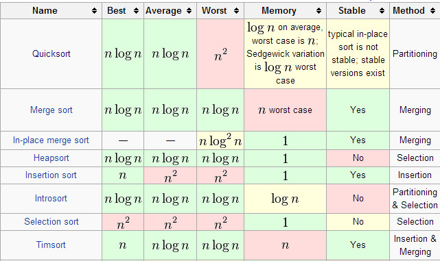
That depends. Slides are generally free and content is easier to consume in sparse slides. Generally a picture or a diagram you can point to while talking is sufficient. But occasionally you might have a lot of content that is interdependent, such as for comparison:

enter image description here

(Taken from Wikipedia.)

This table is dense but it is best presented in it's entirety (with the help of colour) for the purposes of comparison. If the complexity of each algorithm were split over different slides, the comparison would be difficult to see.

A good rule of thumb is to include a minimal amount of content that stands as a cohesive whole: put the question and the answer on the same slide (since one makes little sense without the other), put the comparative data on one slide (since the comparison cannot be drawn otherwise), etc.

Slides should be numbered, but is it better to give the total number of slides on each (e.g., 4/20) or just the current slide (e.g., 4)?

I believe that parts should be numbered rather than slides. For me, 4/20 can sometimes be the psychological equivalent of making an audience watch a pot boil. Progress should instead be emphasised on the level of learning and topics (e.g., using separation slides) rather than an arbitrary slide numbering. "We've looked at X, now we're going to look at Y and Z. ... Okay, now that we've covered Y, all that's left for today is Z."

But slides should certainly be numbered! The audience/students may wish to ask a question or make a note about a specific slide!

1
  • 1
    +1 for People who say "never use animation" (or make similar blanket statements) I feel lack imagination. You can't blame PowerPoint for (the legions of) people who use it incorrectly.
    – Eddie
    Commented Sep 2, 2015 at 15:45
1

Should bullets generally be introduced one-by-one using animations or should the entire slide be displayed immediately?

Teaching should be about telling a story. Whatever you are teaching about should have some sort of flow -- a beginning, a middle, and an end. I teach IT Networking for a living, and often my three-step "story" is: Define the problem, Define the solution, Define how the solution fixes the problem.

Assuming you are following something like techkilljoy's 6 x 6 rule and only have a reasonable amount of text on each slide, it is essential to have the bullets appear one at a time.

If everything shows up at once, the students will sit there and read your slide, and ignore your story. But if there is only one bullet to read (of only 6~ words), they will have read it in the first 10~ seconds, then their attention is back on you, and on your story. Even the students who insist on writing everything on the slides in their notes will only be writing for 20~ seconds, before they give you the attention back. Instead of for the next 60-120 seconds and then "come back to" you when you are part way through your story, potentially having missed something important.

Remember, most of the information will come from your speaking and lecturing. The slides are just little bullet points, often mostly to keep you (the instructor) on track. But hopefully to give the students "hints" at recreating your lecture when they are studying later.

Is animation generally good or bad for lecture slides?

As a general rule, keep it minimalist. HOWEVER, do not take that to mean avoid it entirely. A little animation can create a bit of visual stimulation that simple text can not.

For text, the only acceptable animations are "appear" and "fade", and if you use fade, it should always be set to "very fast" speed (0.5 seconds). The effect is barely noticeable when compared to simply appearing, but makes for a somewhat more 'graceful' appearance of the text. It gives the impression of a more fluid presentation.... especially if you do a good job of introducing the bullet before it appears on screen.

For pictures, images, or abstract concepts represented visually, use animation if it makes sense. One of my classes discusses encryption between two parties. I actually have a message (a letter) move back and forth between my Sender and Receiver (represented as cartoons or faces) as I discuss what each party does with the message to encrypt/decrypt and verify the contents. The animations are simply the "move right" and "move left" animations, also set to very fast.

The vivid/blatant animations like woosh, or spinning text, or bounce or, spiral in/out, and the others, pretty much never make sense, and really shouldn't exist in any professional or higher learning teaching setting.

What is a good approach to take for titling slides?

Text slides ought to be titled. When creating curriculum, most people start with an outline. Assuming an outline looks like this:

Course Name
 * Chapter 1
    - Section A
        * Idea I

Each text slide will be titled with "Idea I", or "Idea II" (not Idea itself, but the actual content of that idea, of course).

If I have a slide which is pure infographics or sequence animations, then I might omit the slide title. This cues the students in to watch the screen, and the furious note takers to put down their pen for a second.

Should I include "separation slides" to chunk content?

Yes, absolutely. There is no reason not to. If gives the students a visual break and the instructor a 'pause' slide to check in with the students, see if there are any questions, or check the time to ensure you are giving students breaks every 45-60 minutes.

Using the outline example above. I might not put a separation slide between each Idea, but I definitely would between each Chapter and Section.

What is the optimal amount of information per slide?

This is often debated, but can be summarized as "less is more". I like what techkilljoy said about the "6 x 6 rule". That is a good guide to follow (but maybe not a hard fast rule). Again, most of the content should come from the Instructor's voice. For example, I might use these bullets to "teach" the entire plot of Disney's Alladin:

  • Aladdin, the street rat, unexpectedly acquires a magic lamp
  • Aladdin wishes to become a prince to impress Jasmine
  • Jafar thwarts Aladdin, and tries to marry the Princess
  • Aladdin outsmarts and defeats Jafar
  • Aladdin frees the Genie

Obviously, if all you read was the bullets above, you wouldn't see how Aladdin was the most successful film of 1992. But with the instructor providing the content, you might get an idea. And if a student was in the class and heard the story, they might be able to recreate it given just the bullets above.

Slides should be numbered, but is it better to give the total number of slides on each (e.g., 4/20) or just the current slide (e.g., 4)?

I prefer "4/20" if the "20" is the number of slides in the current Chapter (see outline above). This allows adults/students to time their bathroom breaks, etc, knowing a break is coming in 16 more slides, assuming the teacher is nearing the 45-60 minutes of lecture mark.

If the "20" is total slides in the presentation, then using "4" or "4/20" produces the same effect.

But definitely, the slides should be numbered. Helps for students wanting to refer to a specific slide, or when the students point out a spelling error, you can just jot down the slide number and fix it later.

0

Honestly, the best slides are those where they contribute to the lesson being taught, but don't reiterate exactly what you're saying. The worst slide design is bullet points that are, ver batim, what you are saying. A common misconception is that powerpoints are designed to use bullets to present everything. While bullet points help to organize some information, generally you don't want enough information on each slide to warrant bullet points. Walls of text stop people from even paying attention to at the very least the powerpoint, at the worst, the presentation as a whole. Depending on your subject, you can either use short two liner quotes or such for a slide, a mathematical equation, etc.

The best use of powerpoints are for visual cues. Many top tier presenters put no more than an individual picture on each slide. Something simple that either helps drive home their key points or makes it easier for the viewers to remember what is being spoken. The key here though is to make sure the picture is simple, as often times, people end up using pictures that are distracting, drawing the attention of the viewers away from the information being presented.

As far as animations go, they should be used sparingly at best, and it doesn't hurt to not use them at all. Again, this goes back to the distracting aspect of things. In addition, if you do use animations, be certain to not use too long or too many animations in a slide, as it does nothing other than slow down the presentation and break the fluidity of the presentation as a whole.

You must log in to answer this question.

Not the answer you're looking for? Browse other questions tagged .