9

I am writing my PhD thesis in engineering at a research university in the US.

My question is about using frames (or boxes) around a plot, specifically simulation results plotted as a function of time. These figures are intended to span the entire width of the type-area (i.e. paragraph width) and are to be displayed prominently.

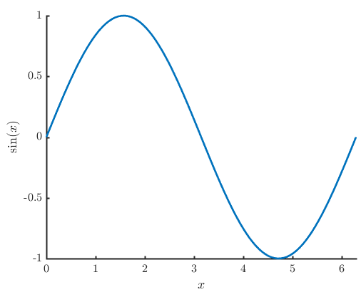
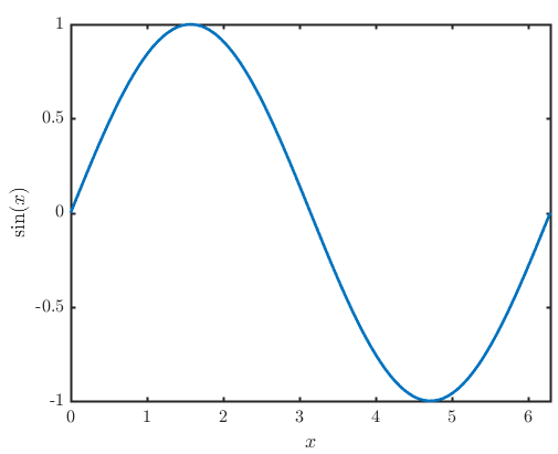
Here is a simple example for comparison between the two options (framed and open):

with frame

no frame

Is there any convention regarding such frames, e.g., as documented by prominent style guides? I am all up for minimalism (use greyscale, avoid clutter etc), but I wonder if removing the surrounding frame itself is too much (and may surprise exam committee in unexpected ways) due to going against existing conventions.

My university doesn’t have a style guide. And when I checked with the research support office, they said that as long as it adheres to acceptable scientific style, it is fine.

PS:

When this question was originally asked on the graphic design SE site, a user recommended that the x-label should not be near the bottom edge of the frame, but rather a horizontal axis should be drawn at y = 0, and the labelling of the x-axis should be done near this. I am skeptical of this advice, since most engineering software (eg. MATLAB) does not do this.

4
  • 3
    Sidenote: While I consider it valid to ask whether there is a convention in engineering (which I wouldn’t know, not being an engineer), the most decisive factor for your actual problem is probably your supervisor’s opinion, whether it aligns with existing conventions or not.
    – Wrzlprmft
    Commented Jun 8, 2018 at 17:35
  • @Wrzlprmft My supervisor does not have an opinion on this. According to them, my PhD thesis is my story and does not want to limit my choices to his preferences. "Whatever maximises the clarity to the wider readership, especially to other Phd students like you, who may be looking to reproduce your results during their own PhD" was their answer. Commented Jun 8, 2018 at 19:53
  • 2
    Well, then lucky you.
    – Wrzlprmft
    Commented Jun 10, 2018 at 12:16
  • While we are at sidenotes: If you strive for perfection, you should use proper minus signs instead of puny hyphens and the same number of digits for tick labels on linear axes.
    – Wrzlprmft
    Commented Jun 10, 2018 at 12:17

2 Answers 2

6

In industry, you’ll often encounter branding guidelines around data visualization: fonts, colors, padding, margins, legends, etc. In academia, enforced adherence to branding guidelines is less common, particularly as an undergraduate. The exception is if you are presenting on behalf of the university or as part of your official role within the university. Even then, your institution may be happy with simply applying their logo to each slide. In terms of publishing research, every journal will have its guidelines that you need to apply to your articles layout and often the figures.

Now, in terms of the larger principles of data visualization, there are several go to figures. Perhaps the best known is Edward Tufte, who’s published a number of books, such as Visual Explanations. One of the ideas he’s contributed to is the maximization of the data-ink ratio (i.e. use the least amount of ink necessary to enable the data to ‘speak’).

In the context of your question, removing the frame is not a bad idea, in most cases they yield no utility. Removing axes entirely may be a bit aggressive. Removing unnecessary ticks and markers may be a nice middle ground. But those are just ideas; try exploring how the idea of a data-ink ratio can be put to use, it’s a fantastic tool.

2
  • thank you for your answer. Marked as accepted. This is for a PhD thesis in engineering. Principles of tufte sound fascinating. I shall have a look. Commented Jun 8, 2018 at 19:49
  • Of course, and yea, Tufte’s great - a modern luminary on how to use visualize data.
    – Greenstick
    Commented Jun 9, 2018 at 16:44
5

There is no convention or guide on this, at least none with appreciable universality. Having said that, one doesn't need a style guide for things like this.

The intention is to be clear to the reader. Minimalism or any other aesthetic ideal is secondary. In engineering, the values on graphs are potentially of interest, not just the trend. So a reader could potentially want to know the value of y(x), and your graph of y vs x should make it as easy as possible for him/her to do so. The top and right axes make it easier to read out values, because (a) you now have two sets of axes to check your value against, (b) a point on the top-right is as easy to read as a point on the bottom-left.

Given that, I wouldn't recommend removing the frame or the ticks on the frame.

4
  • Thank you for the answer. That is indeed a valid point you are raising. Someone on graphicdesign.SX pointed out that, if I am using the frame, the labels on the x-axis should coincide with the y=0 line. I am not sure if this is good advice. Commented Jun 8, 2018 at 19:55
  • Hmm, perhaps that is when the y-axis starts from 0. The reason being that you don't have to separately mention the starting point for both axes. But if your graph has y<0, then naturally the x-axis labels should not coincide with y=0. Commented Jun 8, 2018 at 20:03
  • That makes a lot of sense. Commented Jun 8, 2018 at 20:22
  • 1
    I would also note that frames are particularly helpful when there are multiple plots (possibly with different scales) close to each other, as one might have in a paper.
    – Anyon
    Commented Jun 8, 2018 at 20:59

You must log in to answer this question.

Not the answer you're looking for? Browse other questions tagged .