13

When you turn in a manuscript to an academic publisher, they may insist (referring to their style guide and publication process) that all figures are placed on top/bottom of the manuscript's pages rather than exactly where you need them (e.g., in the middle on one page and on top on another page). Why? Assuming single-column layout and that no huge line stretching, no huge vertical gaps, and no vertical overflows occur, what good reasons could exist nowadays for figures to be moved out of the very place where you need them?

An example could be the figures in the CSP book: they are placed typically where the reader needs them rather than always at the top/bottom of the pages.

5
  • Partly custom. Partly because having a figure messing with my reading / the flow of text is jarring?
    – Jon Custer
    Commented Apr 27, 2018 at 16:27
  • 1
    I don't remember having to change figure placement due to a style guide. However, I have placed numerous figures to the top/bottom of a page to avoid using space for the top/bottom margin. Page limits are a nasty thing. Commented Apr 27, 2018 at 21:30
  • On the technical side, you might be interested in this question at TeX.SE. It is not really about placing images close to text, but rather about being able to have them a bit down from top or a bit up from the bottom.
    – mickep
    Commented Apr 28, 2018 at 9:54
  • "exactly where you need them" You write papers for the readers, so it does not seem important where you "need" (or want) them. I, as a reader, prefer it (need it?) when the figures do not interupt the text. Also note that not all images/illustrations in a text need to be typeset as figures (off course, depending on the style guide). Also, I think this question is off topic.
    – Dirk
    Commented Apr 28, 2018 at 20:28
  • Since you refer to electronic formats, it might be relevant that several journals now offer an HTML format which is effectively a single page. In this case the figures seem to be very close to where they are referenced in the text. Usually at the end of the paragraph, but it can even be at the end of the sentence
    – craq
    Commented Apr 28, 2018 at 22:59

6 Answers 6

20

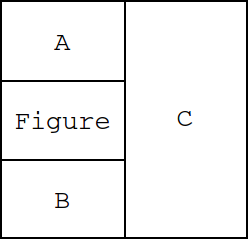
Consider a page structured like this:

enter image description here

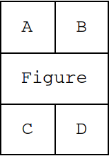
where A, B, C, D are columns of text. In such a case, should one read in the order A–B–C–D, or A–C–B–D? For me, it's natural to read in order texts that are close to each other – so here: A–B–C–D. So I'm always annoyed when the text makes no sense because I read it in an incorrect order. The same applies for a layout like this:

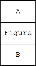
enter image description here

where the text nearest to A is C.

In case of this layout:

enter image description here

the page seems too divided – the continuity between A and B is broken. Also, it doesn't look nice when A consists of 15 lines, and B of only 2 lines (or vice versa): the reader could miss the shorter block, and – again – be annoyed that the text makes no sense. So, one wants to have a layout that will be easiest for the reader to follow.

And the layout when the figure is embedded in the text (e.g., with LaTeX's wrapfigure) can be sometimes found in books – I guess journals decided that this would be too distracting in an article which is usually very condensed.

4
  • +1 To me the only figure that could logically go mid page would be one that is half the width of a column and this must. This works for small illustrations. I've occasionally also seen some that will put a figure in the middle of the page, generally art history in nature. They work too especially when bring included anywhere else would result in excessive whitespace Commented Apr 27, 2018 at 17:42
  • 2
    @MdAyquassar - those 5 lines still break the flow of reading. Multi-column equations, usually less than 5 lines, are pretty bad also.
    – Jon Custer
    Commented Apr 27, 2018 at 18:25
  • 8
    I do not get the argument why it is bad for single column layout. IF A and B are a continuous text, then there is no need to put the figure in between, but if a paragraph ends that even refers to the following figure, the reader would stop and have a look at the picture anyway.
    – koalo
    Commented Apr 27, 2018 at 21:45
  • 7
    "the continuity between A and B is broken" - wait, what? So a reader is supposed to read A, jump somewhere else (top or bottom of the page) to look at Figure whose content is referred to in A and/or a prerequisite for B, and then returns to the end of A to proceed to B? Now that breaks the continuitiy. Your assessment may indicate a misconception, though, in that possibly, there indeed is no continuity between A and B by design. Instead, consider the case when the only intended continuity is from A to Figure and from Figure to B. Commented Apr 28, 2018 at 19:57
8

The flow of reading you want to have is like the one for regular equations in a mathematical text:

illustration of reading flow for simple figure

For some simple illustration of a concept (like most figures in the textbook you are referencing), this flow works fine, and it makes sense to place the figure exactly where it is needed.

Now, for the vast majority of figures in scientific papers it is rather this (also see Figure 1 below):

  1. You read a piece of text which describes that some data was obtained.
  2. You look at plot that summarises the data in graphical form.
  3. You look at the figure caption to understand what was plotted and maybe learn some technical details about the plot or the data acquisition.
  4. You go back and forth between figure and caption until you understand what’s going on and can easily extract a piece of information.
  5. You try to grasp the main points of the figure.
  6. You go back to the text, which describes and interprets the data and at first frequently refers to particular aspects of the data for which you may want to take another look at the figure, but you do not have to. For example the figure below is not so complicated that you may not need to look at it again to remember what this point references.
  7. The text continues about something else.
  8. The text possibly comes back to the figure at a later point.
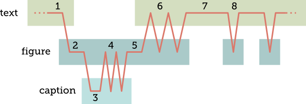
illustration of reading flow for complex figure

Figure 1: Reading flow for a complex figure. The red line depicts the reader’s focus at a given time. The boxes depict what is on the reader’s mind. Numbers refer to stages of the reading flow as enumerated in the main text.


The first reference to such a figure will always be a major interruption of reading flow. Putting the figure not directly at this position but to the top or bottom of the same page is only a drop in the ocean in this respect. (I do acknowledge that the figure shouldn’t be pages apart.) However, in other respects, putting the figure at the top or bottom has advantages:

  • If somebody reads the text a second time and is already familiar with the figure (so they do not have to look at it at all) a figure at the middle of the page would pose an additional interruption of reading flow. A figure at the top or bottom does not do this as the page break already breaks the reading flow anyway (also see Corey’s answer). In this answer, the end of the long list is a similar unavoidable break of reading flow and a good position for the figure.

  • For some figures, there is no perfect position as it depends on the reader’s preferences when they first jump to the figure. Some like to read the paragraph describing how some data was obtained or the key points of interpretation first, others prefer to look at the figure as soon as they see it on the page and before it was even referenced in text. Some even look at all the figures before reading the actual paper.

  • If the reader has to jump between text and figure (point 6 above), it is slightly easier, as the top and bottom of the page provide better anchors for jumping to the figure.

  • If the reader is referred to the figure at a later point in the text (point 8 above), it is easier for them to locate the figure.

So, it does make sense for typesetters or style guides to default to figures on the top and bottom of the page as complex figures referenced from multiple locations are much more frequent in scientific papers. Exceptions from this are rare and robustly spotting them often requires a subject expert, which typesetters are not.

7

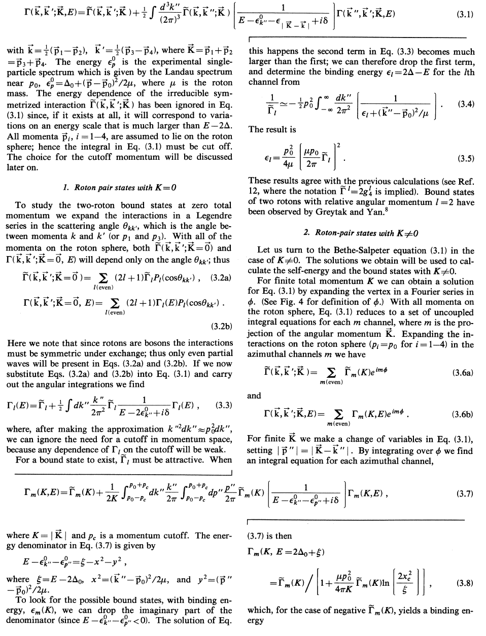
To add a bit to some of the other answers, and address some of the comments about 'short' figures in the middle of text, I've included below a screen shot of a mid-80's paper where several long equations required spanning the two column format.

Maybe I'm old fashioned, but it makes for a really ugly layout, and makes it really hard to read (even with the slight visual indications of where to go from the column-breaking lines). Like all stylistic choices, some people will prefer one, some another. But this page is just really hard to read.

From K. Bedell et al., Phys. Rev. B 29(1) 102-122 (1984)

5
  • 6
    While I agree that the typesetting on this page is not very nice, there are no figures (as I would understand them) here. And moving all equations to top and bottom would render the page incomprehensible. This example mostly seems to illustrate that double-column is not good if longer equations are required.
    – Arno
    Commented Apr 27, 2018 at 23:54
  • Examples like this are why I've never understood why physicists seem so fond of having double column journal layouts. It's as if they want to say "check us out, our stuff is so beautiful and simple that the equations and such totally fit on less than half the page!", while in total denial that this is regularly not the case. The resulting shenanigans to make things fit just makes the entire field needlessly harder to understand to me. Do physicists find themselves having trouble understanding single column layouts, I wonder? Commented Apr 28, 2018 at 6:04
  • 1
    @Arno: For the purpose of this question, any types of floats may be treated the same, as the very same points that you make may apply to figures. The OP might want to clarify that in the question. Commented Apr 28, 2018 at 19:59
  • @O.R.Mapper Sure, but display equation shouldnt be floats.
    – Arno
    Commented Apr 28, 2018 at 23:54
  • @Arno: Well, an equation is a numbered thing that is usually referenced from the text and inserted somewhere outside of a paragraph. That is what I meant by "float". Commented Apr 29, 2018 at 19:26
6

If you are mainly interested in "nice-looking" pages, top and bottom figures are commonly considered more aesthetic.

Frequently, this causes a figure to be on a different page than the part of text that refers to it, which is not ideal for the reader. But this may not be so important for the type-setting people.

Another important thing is that you cannot guarantee that a figure can be placed at the place of usage (text flow might change due to reformatting, insertions, etc.). So you can never rely on a figure really being in the position where you use it. You may be tempted to use words like "the following figure", but you really shouldn't.

1
  • 'You may be tempted to use words like "the following figure", but you really shouldn't.' - well, there are typesetting systems where the appropriate text can be generated. Commented Apr 28, 2018 at 20:03
2

The answers so far all raise interesting points regarding typesetting/page layout. However, there is one consideration they all miss: submitted manuscripts are often re-typeset by the publisher during production (even where you have used a template that looks like the final version). Consequently, just because the publisher asks you to put the figure there, that doesn't mean it will be there in the final version. Indeed, many publishers now have very limited formatting requirements (example) (or optional-only recommendations/templates).

Nevertheless, there are various reasons for the formatting requirements (however many or few) a journal may have. I'm not going to discuss OP's specific question ("why place figures at the top/bottom?"), because who knows why a particular publisher has a particular requirement, but I will discuss formatting requirements in general.

  • They account for how the publisher's computer systems will generate the manuscript that is sent to the reviewers
  • They are suggestions to ensure the reviewers receive something readable (note: not optimal)
  • To avoid breaking the publisher's templates
  • Use of a publisher's styles/templates streamlines production because it enables the automated identification of (e.g.) captions during production, and assists the production staff in identifying and formatting the manuscript.
  • They enable consistent, straightforward measurement of (e.g.) page limits.
  • (Where similar-to-final templates are used, which is not relevant to everything I said above, but is worth including) They allow the author to get an idea of the appearance of the published manuscript.
-3

Usually a manuscript is typed with a typewriter. There is a difference between the correct format of submitted manuscript and the article in final printed form. That means, the figures and tables are shuffled. It is a common misconception to believe that authors are in control of layout. All formatting questions are answered by the journal editor. But the author has the obligation to do some pre-work for getting the optimal result. For example, he should write on the back of each figure the senior author name with a soft pencil and the word “top”. Top means, that the figure can be placed on top. If this will happen in the final printed forms, depends on many other decisions which are outside the scope of the author.

Source: page 16-20 Manuscript Guidelines for the Journal of Wildlife Management, 1988

9
  • 1
    Usually a manuscript is written in LaTeX, and the author can perfectly well ensure that it looks the way they intend. The question raised here is why layout editors may feel compelled to mess around with that.
    – Arno
    Commented Apr 27, 2018 at 18:25
  • 1
    Flagging this as NAA because the question clearly specifies “nowadays”. Even ignoring that, your answer does not address the question, which asked why and not who.
    – Wrzlprmft
    Commented Apr 27, 2018 at 19:44
  • 1
    @MdAyquassar: This is handmade typography. – It just means that the author had some impact on the decision (as opposed to none like nowadays). It doesn’t say why anybody would want to decide that way. For example, why couldn’t the author specify middle as a position?
    – Wrzlprmft
    Commented Apr 28, 2018 at 6:40
  • 1
    This amounts to saying that there are no good reasons nowadays for many formatting rules. This is the most accurate answer to the question imho. Commented Apr 28, 2018 at 10:37
  • 1
    @SylvainRibault: I am getting the feeling that I am looking at a different answer than everybody else. Where does this answer even remotely say this or even hint at this? I can only guess that you assume this answer to imply that there were technical reasons to do this in 1988, but I really don’t see that (and if it did, this would be wrong, because it was quite possible to put figures everywhere in 1988).
    – Wrzlprmft
    Commented Apr 28, 2018 at 13:08

You must log in to answer this question.